Does your site or marketing suite have ‘kerb appeal? Today in an increasingly competitive ‘new normal’ landscape you only get one chance to make a good first impression and position your products or services above your competitors.
What potential customers see from the street is one of THE fundamentals of new homes marketing. It affects the way customers interact with you and your site, and its a deciding factor for potential buyers. So how can you achieve great site presentation?
Customer Journey
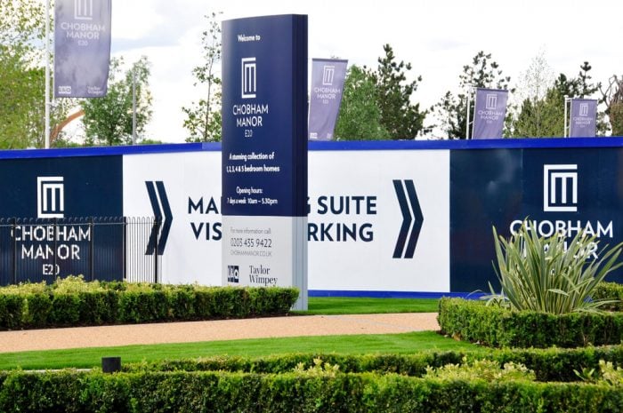
Consider the ‘customer journey’ as the actual, physical pathway to your site or marketing suite. Establish where this ‘pathway’ begins – it could be a transport hub, car park or the street. Where you have most control though is the edge of the site’s boundary to the entrance. Customers don’t want to get lost, worry about parking or in this post Covid-19 world feel unsafe or not reassured by their visit! Mapping out the customer journey allows you to pinpoint key areas where you can improve this user experience.
Read our 10 point plan to becoming covid secure
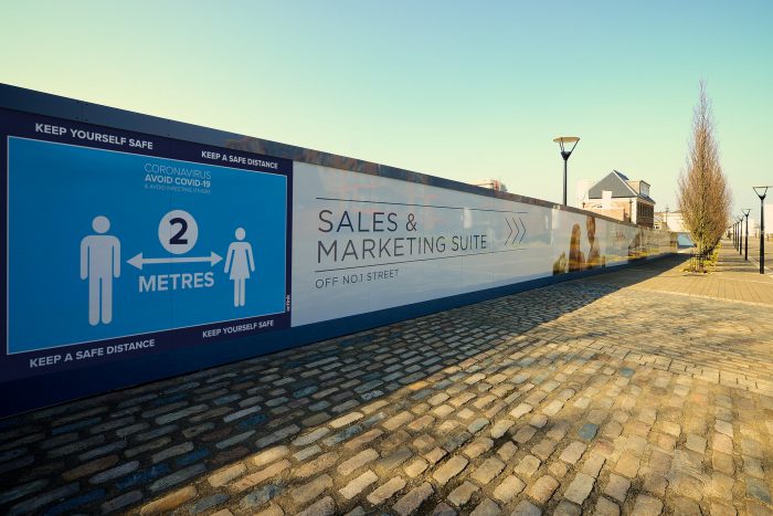
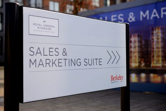
Clear directional signage is crucial, as is good housekeeping, neat landscaping and safe access. Even if you have a small budget, you can easily establish the ‘pathway’ and regularly review it to ensure customers get a great first impression before they’ve entered the door! Creating a customer journey map is a great way to start improving the experience every time a customer comes into contact with your site!
Make a grand entrance
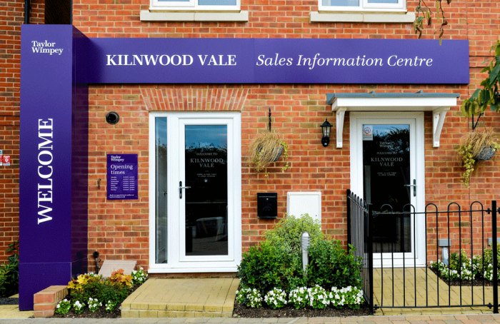
So now your customers are at the entrance…. and kerb appeal is equally important whether your marketing suite has a large, medium or minimal sized approach. Making your frontage leap out and grab attention is key as it provides a positive memory and reminder as customers continue through the buying process.
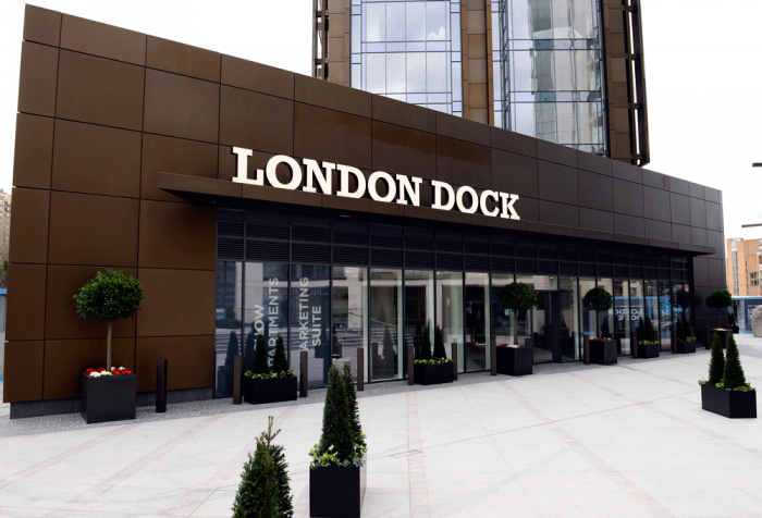
Facades, hoardings, lighting and entrance signage are all great ways to achieve a memorable entrance scenario. Think also about the front door hardware. Items like doorbells, knockers, handles, letter plates, and house numbers, you can update to easily incorporate a stylistic flair to your entrance. For example; sleek, chrome fittings add modernity, whereas vintage, antique black options will be at home in a more traditional scheme.
Be bright, bold and ‘on brand’
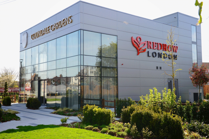
Creating a standout brand identity that feeds through both landscaping and signage (and all marketing) is crucial. Colour palette, logos, powerful imagery can all be combined to create a fresh and memorable new look that will lift even the plainest of facades or hoardings.
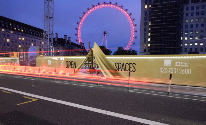
Your company or site’s brand identity can be translated into signage, advertising hoardings, giant banners, flags, fascias, lighting and outdoor digital experiences.
Windows are a blank canvas
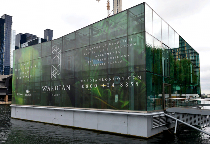
Marketing suites with glass frontages offer a fantastic canvas for creativity and brand application. Innovative window films can offer privacy, one-way viewing, translucency and sparkle. They can give your exterior a new lease of life and lift a marketing suite frontage off the page! Low energy lighting from within can show off branded window frosting beautifully instead of just showing a dark façade.
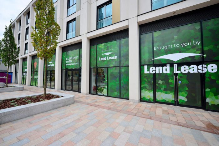
Beware though – full length glass panels also show what’s hiding behind desks and on the floor. Go outside and look at what the customer will see through the windows – your waste bin and an untidy workplace isn’t a good impression!
Don’t forget landscaping
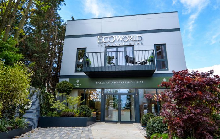
Now you’ve established your customer journey to the door, don’t stop there! Inject some colour and a sense of place by clever use of planting – trees, shrubs and flowers. We’ve been fortunate enough to work on some great schemes, most notably and recently at Verdo for EcoWorld where we worked alongside Kingston Landscaping and the fantastic scheme they produced.
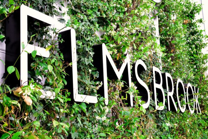
Make sure there’s planting ready to bloom all year round and there’s also ongoing maintenance and regular watering to keep the area looking amazing. Hanging baskets and planters may provide a more flexible answer than flower beds.
Add sparkle with lighting
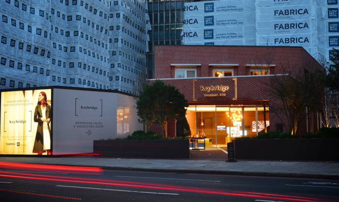
Illuminated facades, signage and lighting placed within landscaping will help deliver kerb appeal late into any evening, whilst adding a welcoming presence even when your marketing suite is closed. Adding changeable colours and effects provides impact and makes your marketing suite even more memorable.
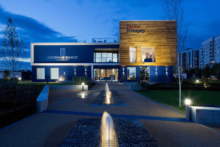
Solar light technology can provide a cost-effective lighting solution to any sign where electricity feeds are not available and also is environmentally friendly.
And finally, the interior…
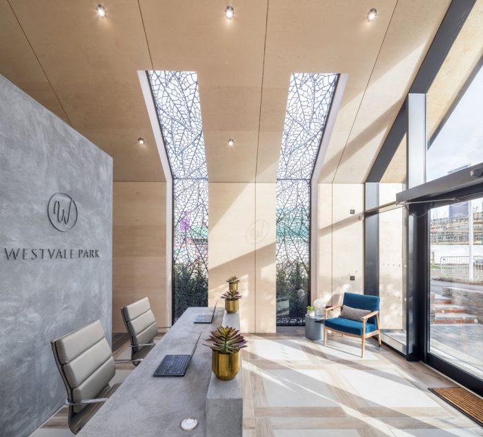
Now you’ve defined your customer journey and created the ultimate ‘pathway’ to bring customers to your door… but it doesn’t end there! How do they get in? Is the door open, do the doors open automatically, do customers ring a bell? Is there a branded welcome mat and space for coats, umbrellas and bags? How are they greeted by your sales team? The ‘devil is in the detail’ when it comes to layout and the welcome once a customer steps over the threshold….
How do we start this process?
Octink is a visual communication expert with many years’ experience in defining and optimising customer journey and kerb appeal.
Our team know what works for businesses like yours, and we specialise in working with companies operating in the property marketing sector.
We can create colour schemes, customer journey plans, signage, office graphics, even fit-out and refurbishment plans. The best part is, we produce all these in-house at our production facility in Brentford, while our installation teams complete the ultimate end to end service.
Do you have questions? Let’s continue the conversation! Contact us today.
About the author: Octink are a specialist supplier of display graphics, signage, and hoardings.
All images used in this article show examples of Octink’s work.